

The bright lights of the conference room glowed again momentarily blinding the executives of the leadership team. Amy had done a good job. The Tableau Visualization on the screen absolutely corroborated why South East Asia is the region the fortune 50 company should look at doing business with in the coming years.
The storyboard corroborated Amy’s recommendation that South East Asia is booming with Business opportunities – there is an inflow of fresh talent and entrepreneurship is in full bloom. These deductions which appear so magical were actually the fruits of weeks of hard work delving into huge amount of raw data and applying techniques like blending sorting clearing and applying joints. These methods though look tedious are much feasible given the cutting edge technology we are sitting on today. But was visualization so advanced and convenient even in the past. I decided to dig up the internet to come up with engaging visualization pictorial representation to show how Data Visualization evolved over time.
The about images and some text are taken from [BBC Learning]
Pre History-
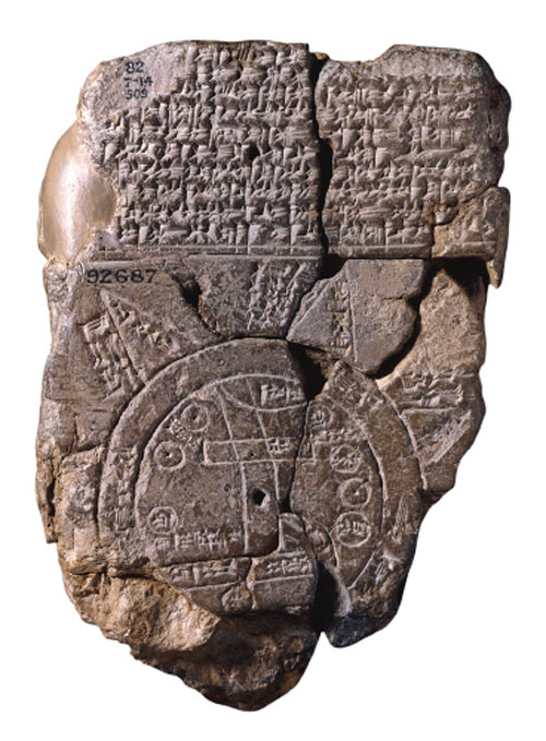
The first visualizations may have taken the form of drawings in sand or scratched on rock and it is possible that the famous Palaeolithic cave paintings in Lascaux, southern France, may have functioned as both hunting guides and directions to the spirit world. The ancient Babylonians, Egyptians, Greeks and Chinese all developed sophisticated ways of representing information visually to plot the movements of the stars, produce maps to aid navigation, and develop plans for crop planting and city development. Many of these early visualizations would have been drawn on clay such as this very early Babylonian world map (600 BC). Later visualizations would be rendered onto papyrus, which had the benefit of enabling information to be more easily shared and annotated.
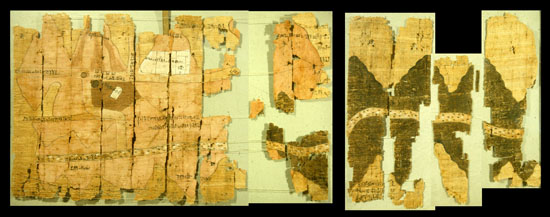
Turin Papyrus Map (Egypt, 1150 BC)
Found in Thebes in the 19th century, this sophisticated Egyptian papyrus map displays a fascinating range of information including geographical and mineral mining data. Recent studies have shown that its colour-coded geological information is remarkably accurate.
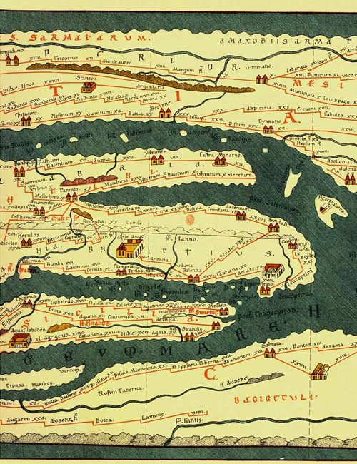
Roman Maps, the Tabula Peutinger (366-335 BC)
The Romans were renowned mapmakers, as they needed to efficiently plan for the movement of their armies and trade throughout the empire. Although only shown here in detail the Peutinger map is a 7 metre long reproduction made by a monk in the thirteenth century. It displays the road system of the empire starting in Britain in the west and finishing in India in the east. Routes are marked as lines and destinations displayed as icons. In this sense it similar to a schematic diagram like the London Underground map designed by Henry Beck in 1931.
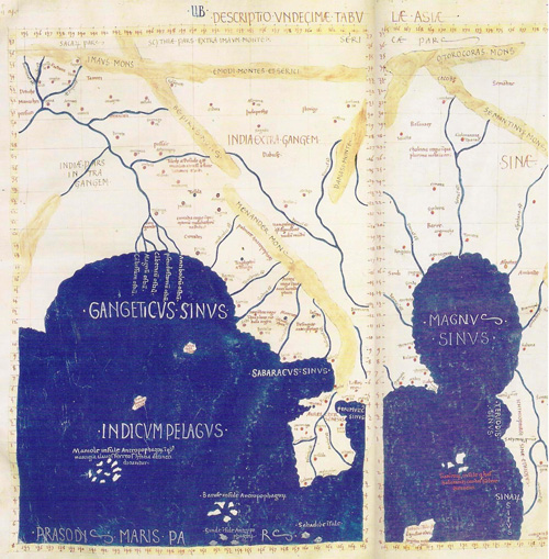
Ptolemy’s World Map (2nd century AD)
Later maps such as Ptolemy’s world map would revolutionise map-making through the use of latitude and longitude markings to develop a global coordinate system. By applying scientific method, maths and astronomy to specify location, these images are forerunners of modern maps.
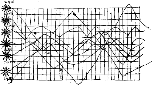
Positions of the Sun, Moon, and Planets Throughout the Year (Europe, 950 AD)
This fascinating diagram is reminiscent of a modern information visualisation as it uses a grid system to combine both the time and location of planetary bodies 800 years before the first true time plotted graphics. While its exact meaning is now difficult to discern, the right-hand side clearly indicates the position and trajectory of the planets and stars, while the horizontal grid refers to periods of time.
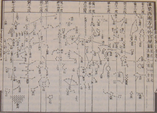
Su Song’s Celestial Atlas (China, 1092 AD)
Su Song was a Chinese scientist active during the Song Dynasty. This star chart uses a sophisticated projection of celestial bodies that employs techniques not introduced to Europe until the 16th century. While this chart was produced after the European chart described above, the ancient Chinese had been producing highly sophisticated visualisations of the stars for nearly a millennia.
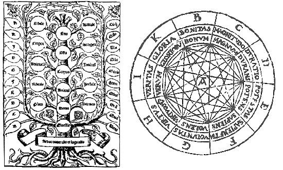
Ramon Llull, Diagrams of Relationships Between Knowledge
Llull was a Spanish philosopher who lived between the 13th and 14th centuries. He believed that there were basic concepts common to all experience, and that by arranging these ideas diagrammatically truths and insights into the human condition could be generated. The wheel diagram shows a series of rotating disks surrounded by terms. Moving the discs allows a realignment of the terms and new combinations of “truth” to be produced. The tree-like structure similarly shows relationships between different orders of knowledge. The use of images to combine and relate information in different ways to generate insights is a mainstay of contemporary visualisation practices and is often described as “discovery”.
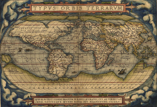
Abraham Ortelius, the First Modern Atlas (1570, Belgium)
Produced by Ortelius in Antwerp in 1570, the Theatrum Orbis Terrarum (Theatre of the World) contained 53 maps with a comprehensive descriptive text and supplementary material. It’s importance lies in the fact that it was the first attempt to gather all known information and maps of the word in one printed volume.
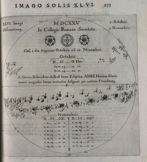
Christoph Scheiner, Images of Sunspots
Scheiner was a Jesuit priest and mathematician working in Germany and Italy in the 17th century. Using state of the art telescopes he studied the markings on the Sun (sunspots) in order to reconcile Church teachings that the Cosmos contained no imperfections, with the visual evidence that it did. The drawings reproduced here demonstrate the changes in sunspots over time and identify different types
18th Century Developments
While many of the previous maps and visualizations we have looked at describe geographic or astronomic information, in the 18th century we begin to see the use of visualisations to make sense of social and historical data; a phenomenon that persists to this day. This occurred for many reasons including the invention of new measurement devices and ways of gathering data, and the need for large states to make sense of their economies and populations. The works shown here have a contemporary look with the first use of bar charts, abstract symbols to represent data, and the development of meteorological and geographic symbols.
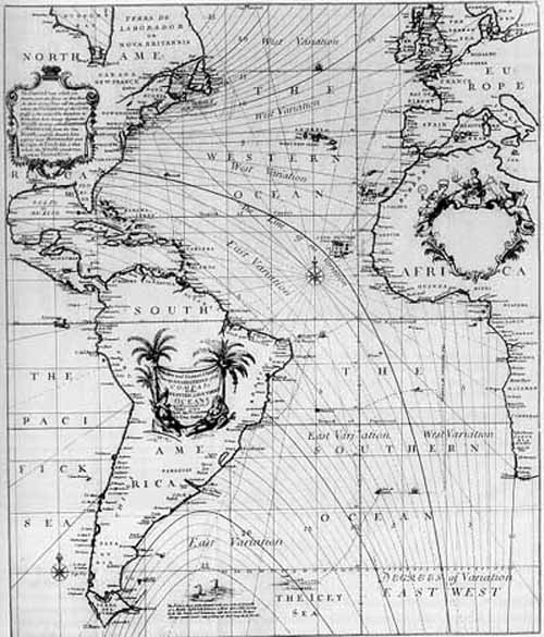
Edmond Halley, Contour Maps
This English astronomer developed the use of contour lines on maps to connect and describe areas that display differences in atmospheric conditions from place to place. These lines are now commonly used to describe meteorological variation common to us from weather reports.
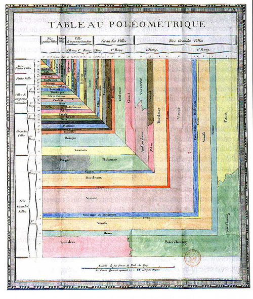
Charles de Fourcroy, Tableau Poléometrique
De Fourcroy, was a French mathematician who produced a visual analysis of the work of French civil engineers and a comparison of the demographics of European cities. His use of geometric forms predates contemporary visualisation techniques such as treemaps.
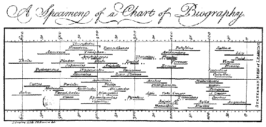
Joseph Priestley, Life Spans of 2,000 Famous People, 1200 B.C. to 1750 A.D
An English chemist and theologian Priestley produced a biographical chart comparing the life spans of the famous stretching back to pre-history. The chart maps names to bars and reads time from left to right.
19th Century Developments
Information visualisation matured into a fully-fledged discipline in the 19th century with the development of many formal and technical innovations which persist to this day. During this period we see images used to analyse military campaigns, weather patterns, climate, geology, disease, social and moral behaviour, and economics and trade.
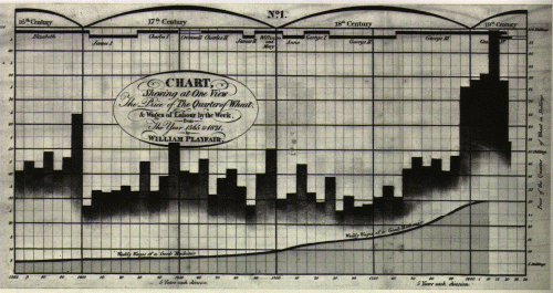
William Playfair, Bar and Time-series Plot of Economic and Agricultural data
Playfair was a Scottish economist and politician, who along with Priestly developed what is known as time-series graphics to show trends in data over time. In this famous example he compares the price of wheat to wages from the 14th century in order to see if a link could be established between the cost of living and the average pay of mechanics, smiths, masons and carpenters. The chart contains 3 layers of information: bottommost wages, a middle bar chart plotting the cost of wheat, and along the top the reigning periods of the English monarchy. While some of the labelling on the chart is difficult to read, it does appear to support the gist of Playfair’s assertion, that on balance mechanical workers pay had risen faster than the price of grain. Playfair produced a number of these visualisations and is also credited with the invention of the pie chart.
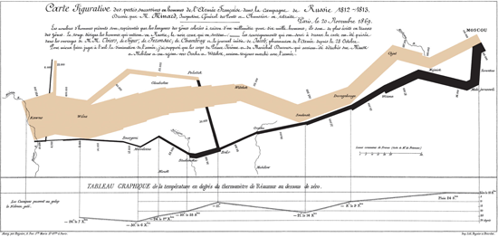
Charles Minard, Napoleon’s 1812 Russian Campaign
Minard was a civil engineer working in Paris in the 19th century. His most celebrated work describes the fate of Napoleon’s army as it advanced and retreated from Moscow in the winter of 1812. The diagram operates as both a visual timeline and geographic map containing the size and direction of the army, temperature, and landmarks and locations. Starting with the thick brown wedge on the left-hand side, we see the army begin the campaign at the Polish border with 422,000 men. The wedge becomes narrower the deeper it gets into Russia and the lower the temperature. By the time Napoleon reaches Moscow the army has halved in size; cold, disease and fighting taking its toll. A slow retreat begins represented by the increasingly spidery black graphic that moves from right to left culminating at the Polish border with a mere 10,000 survivors. This visualisation manages to condense a number of different numeric and geographic facts into one image and is a wonderful example of how visualisations can turn raw numbers into engaging stories about human events.
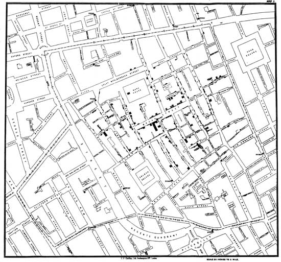
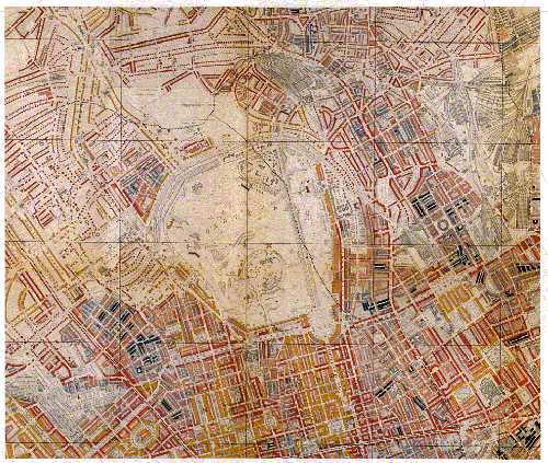
Dr John Snow, Cholera Map of London
In 1854 London was gripped by cholera; many thousands were to die in the ensuing epidemic. Most doctors at the time believed that the disease was caused by foul smelling mist “miasmas” a view contested by Dr John Snow who suspected that contaminated drinking water was the cause. Snow believed that if the disease was caused by air then the incidents of disease would be evenly spread throughout the streets of London, whereas if poisoned water were the culprit, cases would cluster in locations around the source of the contamination. In order to prove his theory he drew a map of Soho marking each case of cholera with a black dot. He also marked each public water pump in the area with an “X”. By analyzing the distribution of black dots in relation to the water pumps, Snow was able to track the origin of outbreak in Soho to Broad Street. Snow immediately advised decomissioning the pump in Broad Street and very quickly the outbreaks of cholera cleared. His map is not only an important historical moment in public health, but also a breakthrough in the visual display of information. By showing abstract medical statistics within a geographic image, a pattern of illness distribution was made visible in a way that pointed to its cause. Today we call such information visualisations Graphic Information Systems (GIS for short).
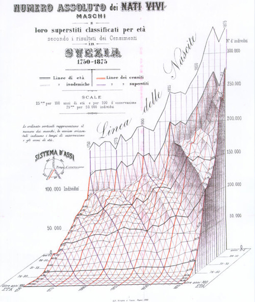
Luigi Perozzo, 3D Model of the Swedish Census
An Italian statistician, Perozzo produced one of the first 3D representations of data showing the age group of Swedish population between the 18th and 19th centuries. In this diagram years are measured horizontally, numbers of individuals vertically, and age groups (youngest nearest) in depth going into and out of the image. The use of 3D to represent data is now commonplace in contemporary scientific visualisation, e.g. medical and engineering sciences.
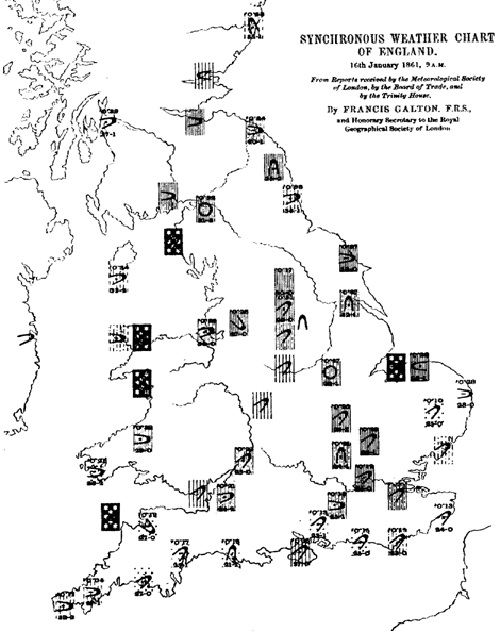
Francis Galton, Weather Charts
Galton was an English scientist and half cousin of Charles Darwin, his contribution to the history of visualisation comes in the form of his meteorological maps and graphical innovations showing the distribution of air pressure and wind direction. Galton’s work paved the way for our modern weather maps.
Charles Booth, Poverty Maps of London
Booth’s colour-coded visualisations of London streets, attempted to answer the question of how many Londoners lived in poverty and what caused it. Looking at the map, buildings marked black denote the poorest or in Booth’s terms “semi-criminal”, dark blue the very poor, purple and pink mixed or people with fairly comfortable incomes, and red and yellow the middle classes and well off. Booth is a pioneer as his work proved the social value of visualisations as a tool for political analysis. His work received much attention from the emerging socially progressive politicians of the day.
20th Century, Enter the Computer
By the early to mid part of the 20th century information visualisation had entered mainstream use and had become commonplace in magazines, cinemas and newspapers, but it was the emergence of computer technology that was to produce the next revolution in the subject. During the Second World War computers had proved very effective at handling the vast amounts of data needed to analyse military intelligence, providing a post-war technological platform for the development of new ways of plotting statistics graphically. By the 1970s and 80s the first full-colour computer visualisations were being developed and interactive graphics were providing new ways of revealing the stories hidden in data by enabling navigation of it in three-dimensions. Some highlights include:
Howard Fisher, Software Breakthroughs
Working at the Harvard Laboratory for Computer Graphics and Spatial Analysis in the 1960s, Fisher developed the first general purpose mapping software.
Jason Dykes, Cartographic Data Visualiser
A map visualisation toolkit developed in 1996, including interactive options for exploring combinations of geography and information.

21st Century and Beyond, Democratising Visualisation
The emergence of the Internet in the latter part of the 20th century, the availability of new software tools such as Flash, Google Earth and Processing, and the increase in publicly available data, has seen a huge increase in types of data visualisation. Whereas in the past, various graphical aids for interpreting data have mainly been produced by specialist statisticians and scientists, in this new era we see an increasing appetite amongst members of the general public to produce their own. The BBC DataArt project is of course a good example of this and other important resources and examples will be featured in the learning resources section of the site as the project progresses.
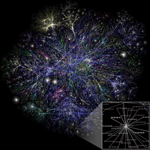
Visualisation of the Internet by the Opte Project.
Further research
This brief history summarises work produced at the excellent Milestones project run by Michael Friendly and Daniel J. Denis from York University, Toronto.
It has also drawn upon the exemplary work of Edward Tufte whose website can be found here.

Leave a comment